
 Creative design exists in places one is often prone to overlook—the woodwork of a coffee table, the shape and size of a book, the contours of a shoe. Somebody made a conscious choice to design these things in a specific way. The way the alphabet is stylized is no different, from the no-nonsense of Times New Roman to the sophistication of Baskerville Old Face to the clean modern Arial. Fonts, typefaces, letterforms and all things typographical are an important if subtle aspect of written communication.
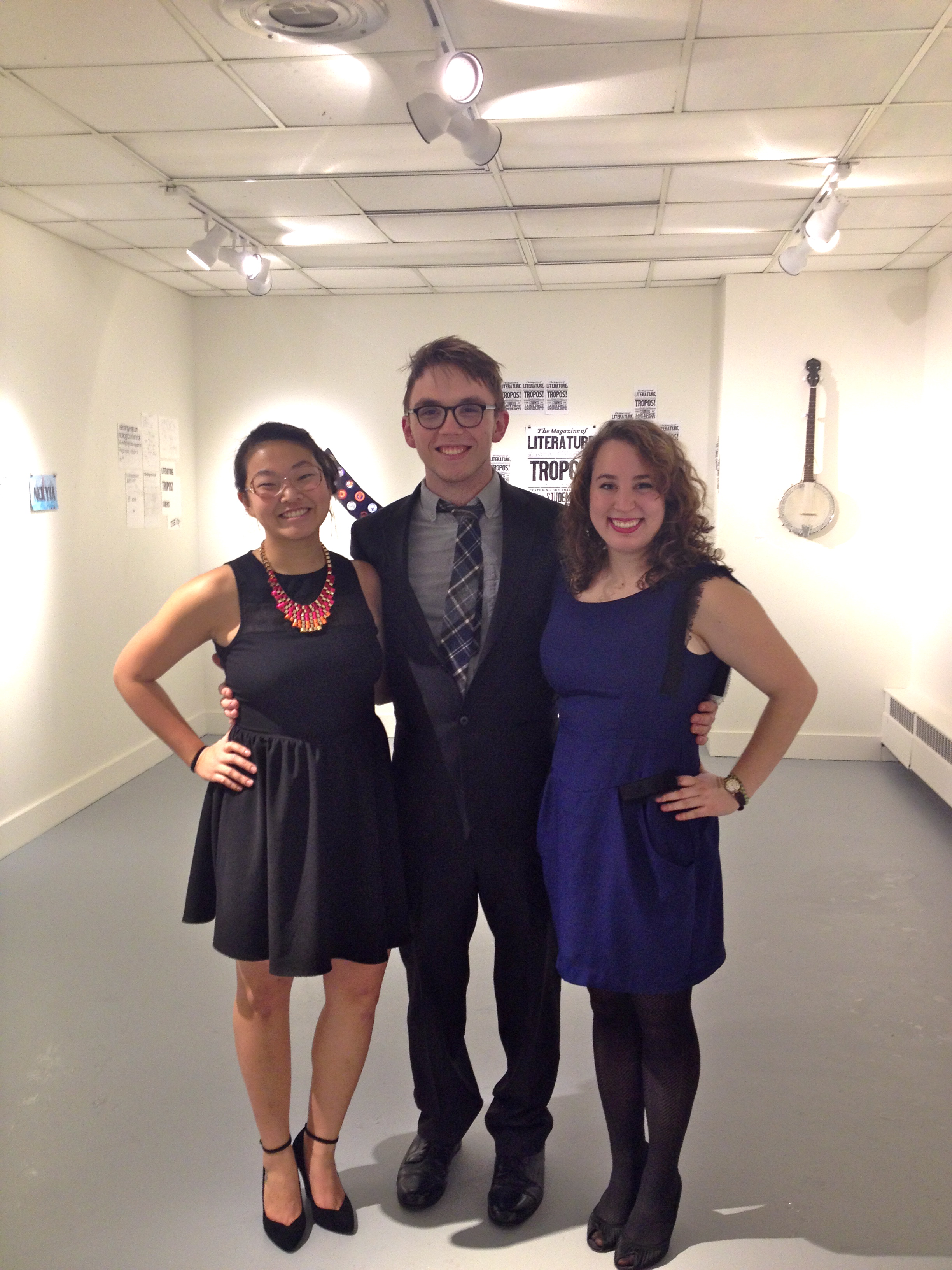
Three Lawrence seniors—Cori Lin, Emma Moss and Erik Morrison—took it upon themselves to research typography and design their own works in an independent study last fall. Their completed projects are available for viewing through Friday, Jan. 31 in the Mudd Gallery on the third floor of the library.
Lin created a series of precisely cut out phrases from a single sheet of paper. She chose phrases that she is known to repeat often in conversation, which is intended to merge visual and discourse patterns.
“I am very drawn to hand-drawn letterforms,” Lin explained. “I love the needless meticulousness required to sketch by hand what could be produced by a computer. Probably because I’m a control-freak, but I really enjoy shaping a letter by hand until it looks perfect.”
Moss created an eclectic array of works, such as a gig poster, a letterpress series of Greek epic terminology and hand-painted lettering. This last is shown in her Snow Queen piece, which was a third place winner in Appleton Downtown Inc.’s holiday window display contest.
“Letters can be incredibly expressive,” said Moss, “and a great tool in helping convey the appropriate tone for any given message.”
Morrison investigated handiwork in letterforms. One striking piece is the cover for the upcoming 2013-2014 issue of Tropos, Lawrence’s literary magazine. In addition, Morrison created a series of amusing university-inspired merit badges, obtained for feats like pulling all-nighters and using a font other than Times New Roman in an essay. Morrison describes these works as inspired by “19th century commercial printing” and “hand-lettering from folk traditions.”
Aside from aesthetic appeal, there is a psychological reasoning behind deliberate word styling.
“In terms of fonts, we subconsciously analyze the way texts look, regardless of their context,” explained Lin. “Everyone makes associations with fonts with which we are familiar, like how many people don’t take signs written in Comic Sans very seriously. Even if we are not conscious, the way type is presented influences our understanding of the words.”
Not everyone needs to be an alphabet carver, however, just as everyone need not be a woodworker or a book designer or a shoemaker. The only necessary action is to be aware of the quality of the work, where these explorations in typography meet between utility and artistry. Especially in the realm of graphic design and advertising, it’s important to understand why one font or letterform is more appealing than another. These three students have demonstrated just a tiny sliver of the infinite ways in which the written word can be structured, but they are nevertheless illuminating and interesting pieces of art.