
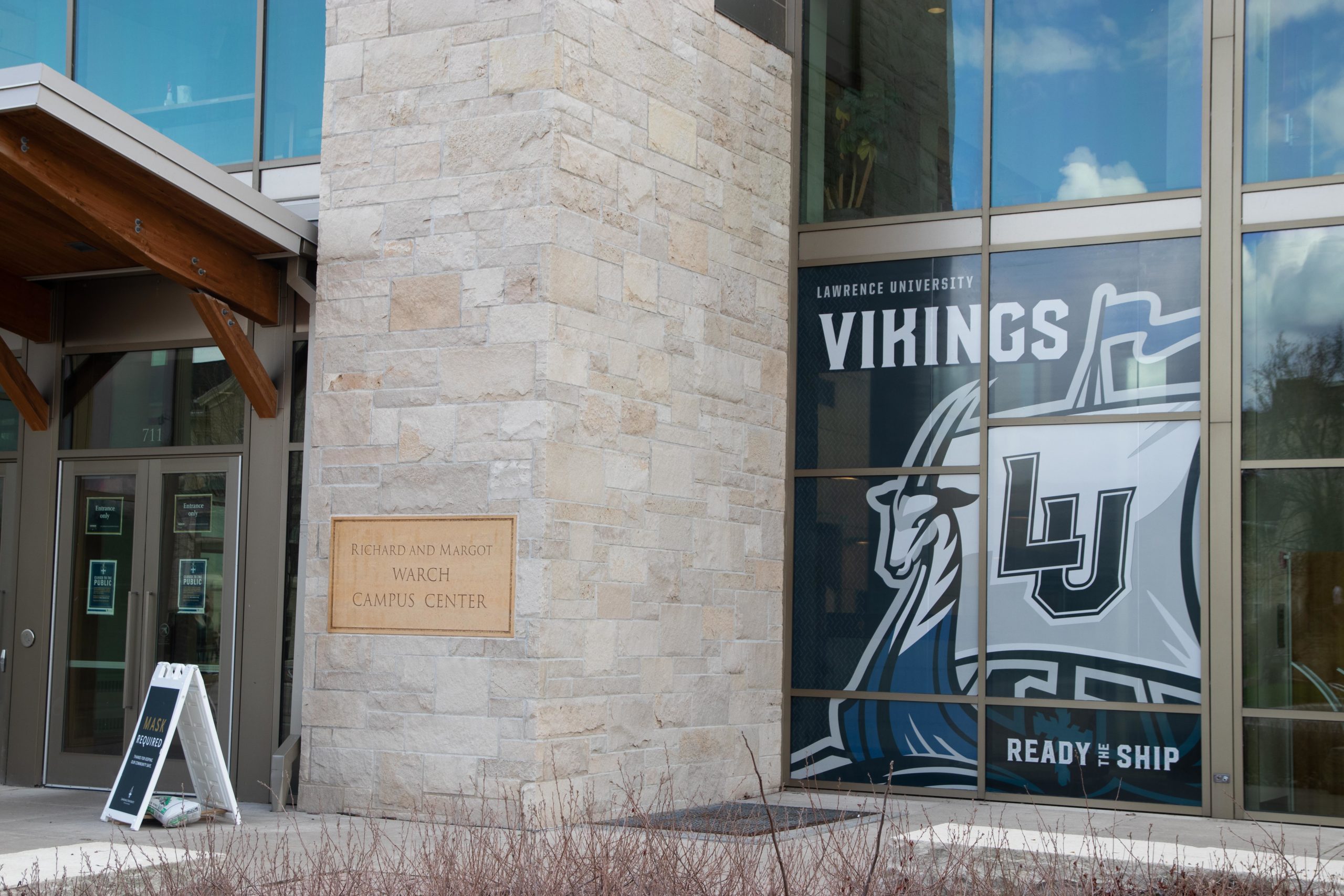
The new Lawrence University Vikings’ logo has been on display in the Warch Campus Center’s front window since April 6. Photo by Alana Melvin.
The Lawrence University Athletics Department launches its official rebrand, featuring a new logo, new uniforms and new meaning for the Vikings.
The Lawrence University Athletics Department celebrated the launch of their brand-new logo at an event entitled “Ready the Ship” on April 6 from 5 to 6:30 p.m.
Athletic Director Kimberly Tatro said that this event allowed students to participate in sporting events such as baseball/softball toss, soccer goal shooting and hockey puck shooting “where everyone was a winner!”
Tatro stated that the committee that planned this event comprised members of Communications staff, Athletics staff and three students: junior Kelsi Bryant and seniors Ceara Larson and D’Andre Weaver.
According to Tatro, their goal was to host an enjoyable event that adhered to COVID-19 guidelines and Honored the Pledge.
Football coach Tony Aker said that to him, the Ready the Ship event allowed the Athletic Department to “invite people on the ship.” By holding the event on campus, they were able to celebrate LU Athletics and the entire Lawrence community. Aker believed that it was especially important to hold a safe event that could bring joy to the community during the struggles caused by the COVID-19 pandemic.
According to the “History of the Viking” page on the Lawrence University sports web page, variations of the Viking head logo have been featured by the Athletic Department since the 1970s. Lawrence has used the current “interlocking LU” logo since 2013.
An email from Communications sent on April 6 described the new logo as a ship with “the fierce antelope of the Amos Lawrence Family Coat of Arms on the prow, the shield of the Lawrence University Crest on the port side and the trusted LU adorning the sail.”
Tatro stated that the Athletic Department decided to replace the Viking head logo because they wanted something that could distinguish Lawrence from other universities and teams.
“The goal was to create something more inclusive and gender-neutral in nature,” Tatro said. “The logo has a modern feel while also tapping into our history.”
Aker explained that the new logo is “ours” and emphasized the symbolism of the ship.
“We all know that something that massive takes a team effort to build and sustain and firmly believe that it represents all of us,” Aker said.
The athletic department will integrate the logo into each team over time as they acquire new uniforms, said Tatro. The “interlocking LU” will still be included in branding. Junior and member of the softball team Chapin Grumhaus explained that the softball team has already ordered warm-up gear featuring the new logo. Tatro also emphasized the Athletics staff’s gratitude to President Mark Burstein for financially supporting the Ready the Ship event and rebrand.
Additionally, many people worked together to both create the logo and send out the announcement. According to Art Director Matt Schmeltzer, he and freelance illustrator Mike Tessmer led the logo’s design. Then, several people on Athletics and Communications staff helped with the announcement: Kim Tatro, Megan Scott, Mackenzie Huber, Kelly Landis, Ed Berthiaume and Joe Sagar.
Schmeltzer further stated that the new logo stands out from the previous one in that it is the sole Viking Ship logo with an antelope head on the prow.
“Unlike the previous logo, we really wanted to come out of this process with something that is entirely unique to Lawrence, so moving away from a more traditional ‘Viking logo’ made sense,” Schmeltzer said. “It’s also gender-neutral and more inclusive. It’s a fresh, new look that the entire Lawrence community can be proud of.”
Read more about the history of the LU logo here.