
 It’s looking at me. The art is looking at me. Well, not really. It doesn’t have a face, but still. The…what is the appropriate word? Sculpture? Installment? It’s simple, yet strangely fascinating. It starts out with three eyes and a mouth at the very top, and then, to mathematical scale, they get larger and larger, until it looks like its boring right into your soul.
Personally, I’m not sure dressers were meant to have that effect, or meant to be stacked on top of each other period, but BA Harrington’s “Chest on Chest” exhibit, one of three galleries that has opened in the Wriston Art Center this weekend (as well as the gallery itself opening for the entire year), isn’t meant to do what we think it’s “supposed” to.
Really, none of the three exhibits that opened has much interest in providing conventional pleasure or satisfaction. Harrington’s exhibit, for instance, is exactly what it says on the tin: various dressers—specifically from early America, New England specifically—stacked on top of each other. There’s the widening face I just described, and one that resembles two giant desks that reaches taller than a person’s height, only for us to realize that the piece is really the skeleton of two giant dresses, or, even more tantalizing, the frame of one enormous dresser, just waiting to built, though one must wonder what the purpose of such a giant piece of furniture is.
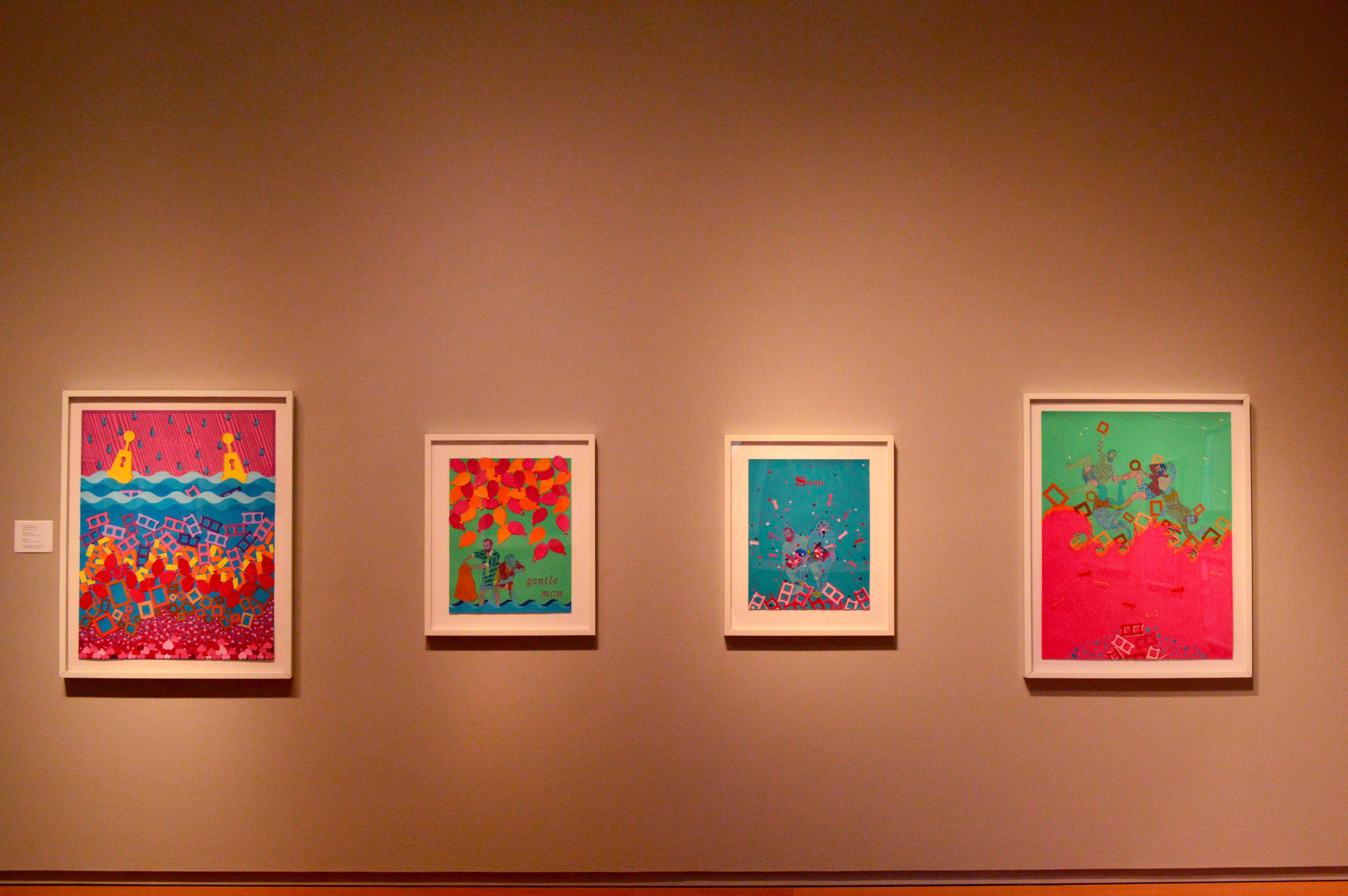
The second exhibit that awaits is Nathan Vernau’s “Scraps & Debris” gallery, which I’m not exactly sure is an accurate description. For one thing, there’s not really much debris present in his work, though there’s a lot of scraps. Construction paper cut into a variety of shapes texturize his illustrations, which look like a forgotten children’s book, or a graphic novel made by an Indian influenced art collective. Strange words dot some of his images, making sense individually, but within context make the viewer feel confused, and slightly frightened.
Of course, who cares about any of that when the art looks this good. Vernau’s use of color is, quite simply, stunning, the kind of richness that would transcend even colorblindness, and often looks like the coolest concert poster ever made.
The third exhibition is, compared to the other two, remarkably plain. There are prints and woodcuts from a variety of sources, gorgeous and filled with detail that you can get lost in. There are patterns from Works Progress Administration in the Great Depression that look like patterns you’d see in your home today, and probably still are. Then, there is the photo exhibition, It’s prairie themed, dating from the Great Depression and the Dust Bowl era. So yes, it does contain a picture of “Migrant Mother”—freshmen, get ready for that in a few weeks. At the same time, the picture is re-contextualized and explained, so even if you’re sick of talking about that picture from Freshman Studies, you can take comfort in knowing that there’s still a lot left to learn and ponder about something that seems so familiar. Which of course is the whole point of exhibitions in the first place.